How precious should you be with your strapline?
Straplines come in all shapes and sizes and with every conceivable internal dynamic. Some work instantly, some burn slow, some last for ever and some, like jokes and fish, are best served fresh. So when BP went through the great change in 2000 it did seem appropriate, if a little obvious, that the new lower case bp logo stood for beyond petroleum. Unfortunately its impact soon began to fade, and the freshness began to feel more like smugness, self-satisfaction. Strap lines can be the making or breaking of corporate identities and not all are distance runners.
Beyond also wasn’t really the right word, it just fitted. The energy business was in the process of looking within, without and all around oil, gas and other carbon fuels for new energy sources, with renewables like wind and solar being the lighter-weight contenders; BP was bidding for leadership in an emerging energy race and beyond petroleum seemed limited, and just a bit tame.
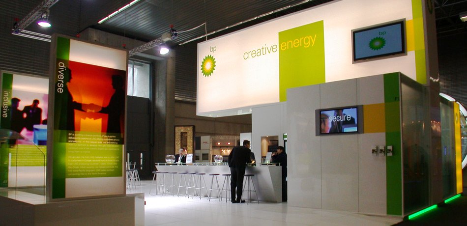
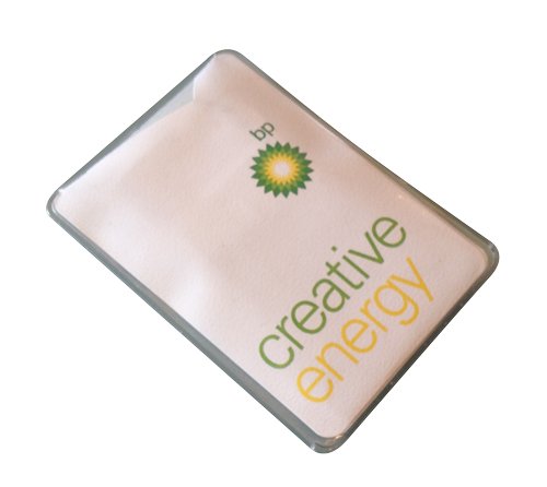
When we were briefed to develop an exhibition stand for the global LNG14 fair in Bilbao, we thought maybe we should suggest an alternative, and persuaded the client to adopt a theme for the show we felt could actually reflect a more progressive attitude. There’s a dynamic in Creative Energy, it’s active, challenging and it was a true reflection of the way the company was thinking – everything I like in a theme. Worked a treat in that one exhibition, never managed to break out into the broader company. Shame.